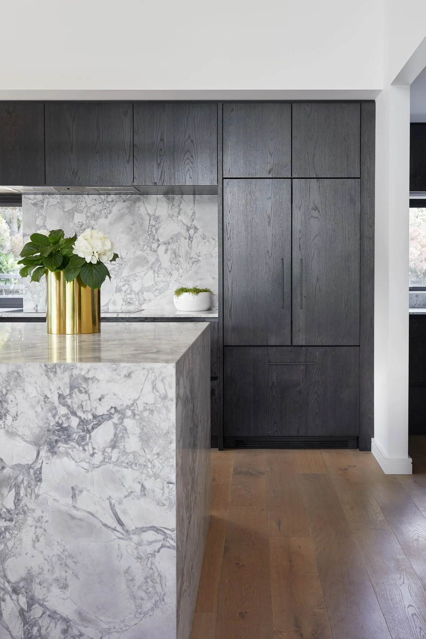
A home of grand proportions
On their rural property south of Auckland, existing clients had a vision to build an architecturally designed masonry home of grand proportions, including a kitchen with clean lines, feature stone and timber cabinetry.
Due to it’s scale, the home required steel beam portals, which proposed a challenge for the kitchen and scullery design. As well as this, a large window on the back wall significantly reduced the options for cabinetry placement and could have disrupted the client’s vision of having clean lines.
It became clear that we needed to visually clean up the lines as much as possible and incorporate the window to read as part of the kitchen. The concept was to create a thick, full-depth panel to hide the wall and beam, to give the kitchen a clean finish and almost frame the back wall.
The overhead cabinetry was extended full-depth above the window to help elongate and create a strong clean line across the width of the kitchen. With pressure on the remaining wall space, the cooktop was positioned to the edge of the window to allow for more workspace on the right-hand side, also opting for a large under-bench oven. The fridge was integrated for a contemporary look, with better hinging achieved via a spacer panel against the wall. To have the window read as part of the kitchen we ran all surrounding materials into the aluminium window joinery.
The luxurious Super White Dolomite stone acts as a strong contrast and complements the textured dark stained oak cabinetry. The Super White is the hero within the room and repeated on the splash back and in the scullery, rather than introducing another material.
As the proportions of this pavilion were generous, we increased the depth of the island to 1500mm to create additional seating and add more visual balance to the overall effect. Seating was designed at one end to be more social, while solid stone on the opposite end of the island adds weight, contrast, and scale on entering the home.
In the scullery, a large list of requests included a hot water cylinder, sink, dish drawer, hot water tap/unit, combi oven, bin, and general dry good storage.


